
The triple top pattern that we mentioned in the previous report “Topping over, tapping out” failed to materialize and instead, we saw how the US equity market rebounded off the Brexit lows and broke new record highs. Nonetheless, our bearish view remains firmly rooted as the fundamentals showed further signs of deterioration. In this report, we will be using the S&P 500 index as the proxy for the US Equity market and analyze how the following macro indicators behaved during crisis recessionary periods.
Chart 1. GDP YoY
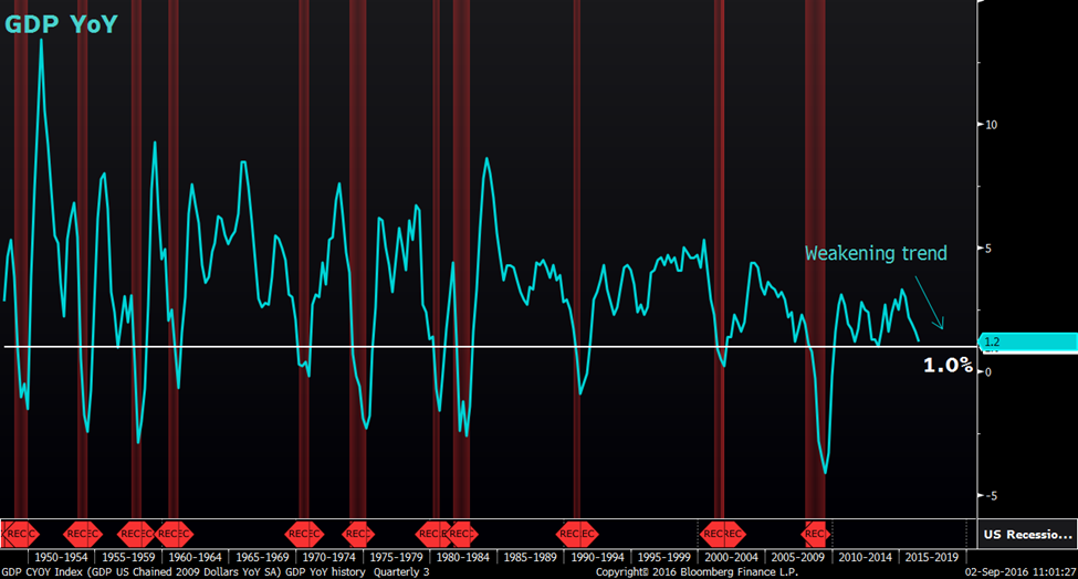
Source: Bloomberg
We notice a very telling pattern in the GDP Year on Year (YoY) change chart. The data go as far back as 1948 and it has 100% accuracy of forecasting a recession.
The 1% mark appeared to be the critical dividing line between a healthy economy and one that is entering into a recession. From the chart above, every single time when the GDP YoY change falls below the 1% mark, the US economy is either already in a recession shown by the highlighted region or gradually heading into a one. In other words, the slowdown in the growth of the GDP YoY change is evident in forecasting a looming recession.
Since 2015, GDP has been slowing down sharply from a growth rate of 3.3% to the most recent 1.2% for Q2 2016. Watch out further subsequent GDP data releases to see if the downward trajectory continues or not. The drop below the 1.0% mark which is not too far away should warn us that a recession is around the corner.
Chart 2. S&P 500 vs GDP Investment QoQ
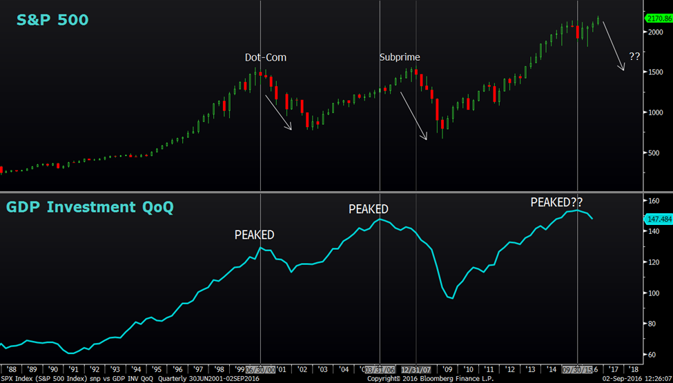
Source: Bloomberg
| Breaking down the GDP into its smaller subset, we took a look at the GDP Investment component and found something interesting. The GDP Investment Quarter on Quarter (QoQ) change seemed to be able to predict some sort of a market correction.
Looking at chart 2, the top panel depicts the S&P 500 Index while the bottom panel depicts the GDP Investment QoQ change. There is a strong positive correlation between the S&P 500 and the GDP Investment QoQ change. During the Dot-Com crisis, the GDP Investment QoQ peaked out perfectly in line with the S&P 500 in Q2 2000. During the Sub-Prime crisis, the GDP Investment QoQ peaked out around Q1 2006 while the S&P 500 only peaked out around Q4 2007, giving investors ample time to prepare for a massive market correction. Looking forward, the GDP Investment QoQ seemed to have found a peak back in Q3 2015 and it has trended lower since then. If the Q3 2015 peak holds true, there is a high chance that the S&P 500 could be heading into a massive correction in the near future. Chart 3a. Industrial Production YoY |
Source: Bloomberg
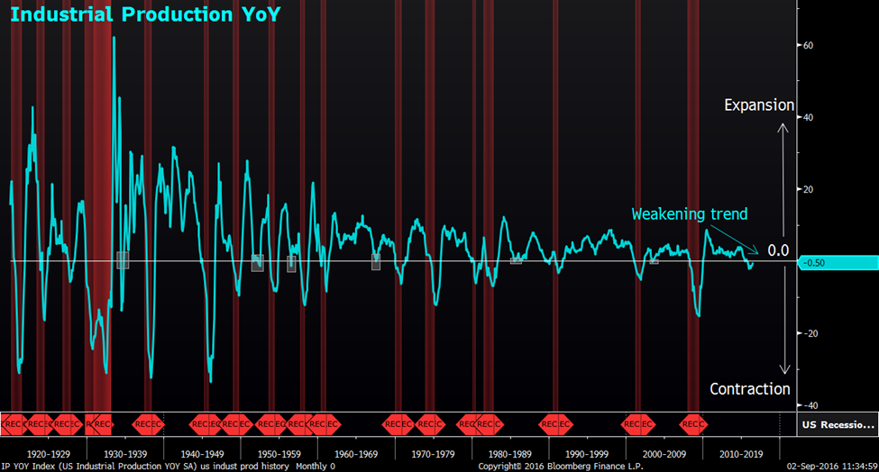
| Looking at the manufacturing side of the equation, chart 3a above shows a bleak future as the Industrial Production YoY trend continues to weaken. Industrial production measures the output of industrial establishments in the mining and quarrying, public utilities and manufacturing industries and is often regarded as a leading indicator of economic health.
The study on the Industrial Production YoY goes as far back as 1920. Every time when the Industrial Production contracted, dropping below 0, the economy is either already in a recession or heading into one. In total, there were 23 periods of contraction and 6 failed (July 1934, April 1952, July 1956, July 1967, July 1985, June 2003) to call for a recession shown by the highlighted box implying an accuracy rate of 73%. Taking a deeper look into the failed signals, we found out that the longest duration of contraction was only 4 months in both 1934 and 1952 periods while the rest were only 1 month of contraction. With that in mind, the current count of Industrial Production contraction stands at 11 months which clearly suggests a high degree of certainty that the US economy is gradually slipping into a recession. Chart 3b. S&P 500 vs Industrial Production YoY |
Source: Bloomberg
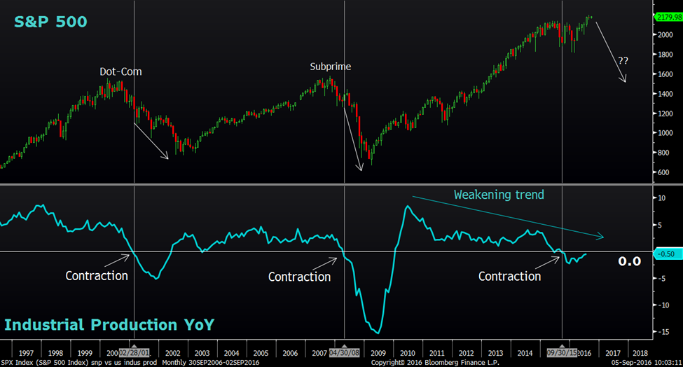
| To show the implication of how the Industrial Production is going the affect the market, we overlay the S&P 500 onto the chart. The results showed S&P 500 crashed alongside with the Industrial Production as it falls below the 0 level back in 2001 and 2008 and subsequently accelerated the stock market crashes. |
Fast forward to current time, the Industrial Production YoY change has been contracting for the past 11 months on a YoY basis and it first dipped below the 0 level back in June 2015 suggesting that a huge market correction is imminent.
Chart 4. S&P 500 vs ISM Manufacturing PMI
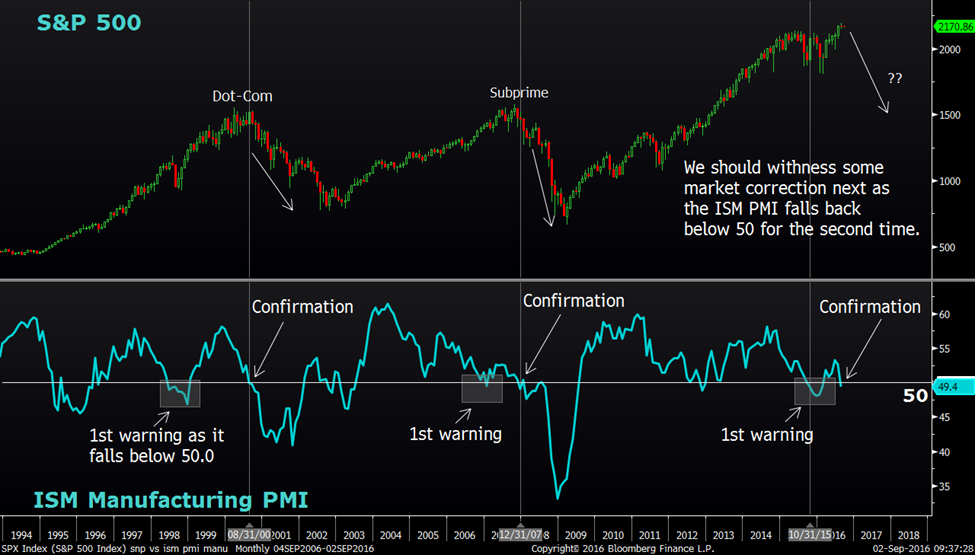
Source: Bloomberg
| The ISM Manufacturing PMI is also signing the same tune. The PMI Surveys track sentiment among purchasing managers in the manufacturing industry and a reading above 50.0 indicates industry expansion while a reading below 50 indicates contraction.
It provides quite a good indication of where the S&P 500 might be heading as we notice how the ISM Manufacturing PMI tend to slip below the 50 level first before confirming a market crash. Notice how the ISM Manufacturing PMI slipped below the 50 level back in June 1998 and January 2007, a few months before the respective market crashes. The confirmation of a market crash was seen by the PMI subsequently falling back below the 50 level again the 2nd time in August 2000 and December 2007 respectively. The current picture resembles the previous 2 market crashes in a similar fashion as the PMI fell below the 50 level back in October 2015. That was the first warning sign of a weakening economy and the PMI managed to make a slight rebound back above the 50 level subsequently. Ultimately, the weakness persisted and the most recent reading took the PMI back below the 50 level to 49.4 for the month of August, confirming the bearish narrative. We should be expecting an impending market correction soon. |
Chart 5. S&P 500 vs Retail Sales YoY
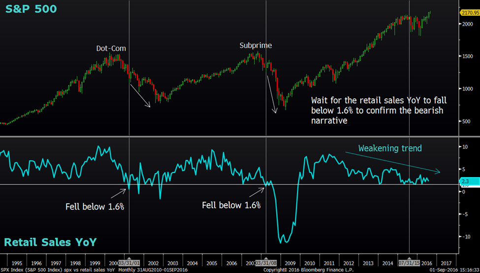
Source: Bloomberg
| Moving on to the consumer side of the equation, Retail Sale seemed to be doing badly too. Retail Sales YoY growth peaked out way earlier in 2011 and has trended lower since then. Basically, retail sales track the resale of new and used goods to the general public, for personal or household consumption.
In hindsight, the 1.6% level proved to be a crucial number to watch. As the Retail Sales YoY growth fell below 1.6% back in March 2001 and March 2008, it sped up the market crashes in the Dot-Com and Subprime Crisis respectively. The last reading of the Retail Sales YoY change stands at 2.3%. A fall below 1.6% should provide us the signal that a market correction is underway. Chart 6. S&P 500 vs NYSE Margin Debt |
Source: Bloomberg
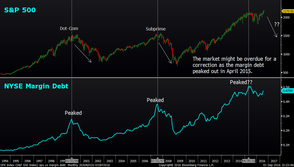
| The NYSE Margin Debt figure is the total amount debit balances in the customer securities margin accounts held at the NYSE member firm. Simply put, the margin debt is the fuel that moves the market and it has a strong positive correlation to the S&P 500. We can see how the topping over pattern in the Margin Debt spelled out the market crashes back in 2000 and 2007 respectively. |
The Margin Debt seemed to have peak over once again in April 2015 suggesting a market correction is looming. Look out for the NYSE Margin Debt to continue the downward trajectory to confirm the April 2015 peak.
Chart 7. S&P 500 vs Adjusted EPS
Source: Bloomberg
| The Adjusted EPS index measures the S&P 500 company earnings as a whole and it is based on income from continuing operations excluding gains, charges and one-time items.
The correlation of the Adjusted EPS to the S&P 500 is pretty similar to the NYSE Margin Debt where the peak of the Adjusted EPS brought about the subsequent market crashes. It held true for both Q1 2000 (Dot-Com Crisis) and Q2 2007(Subprime Crisis). The Adjusted EPS appeared to have peaked over once again in Q3 2014 and the S&P 500 is overdue for a market correction if the correlation holds. |
Chart 8. S&P 500 vs Non-Farm Payroll
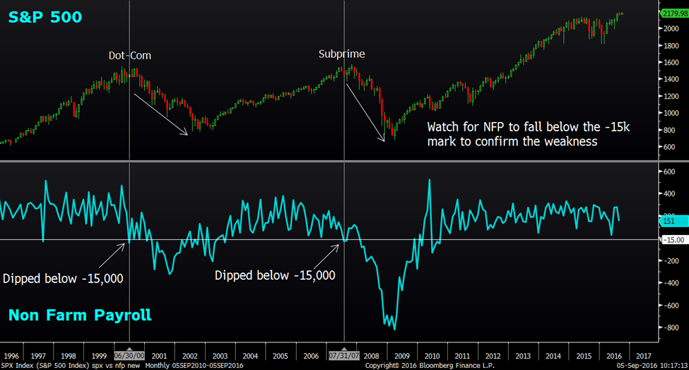
Source: Bloomberg
| Looking at the headline employment number, Non-Farm Payroll (NFP), things appeared fine as the economy added more jobs recently in the acceptable range. The NFP bounced off from a low of 24, 000 for the month of May to a reasonable 151,000 jobs for the month of June. However, the other labor market indicator such as Unemployment Rate, Labor Market Condition Index (LMCI) and Philly Fed number of employee diffusion index suggest otherwise. |
During good times, NFP tend to add 44,000 jobs on lower bound and 376,000 jobs on the upper bound. Things start to look ugly when the NFP dips below the -15,000 mark, suggesting a net loss of 15,000 jobs on a monthly basis. That was exactly the case during the Dot-Com and Subprime Crisis where the S&P 500 formed their respective tops. Moving forward, look out for the NFP to fall below the -15,000 mark to reaffirm the market correction thesis.
Chart 9. Unemployment Rate
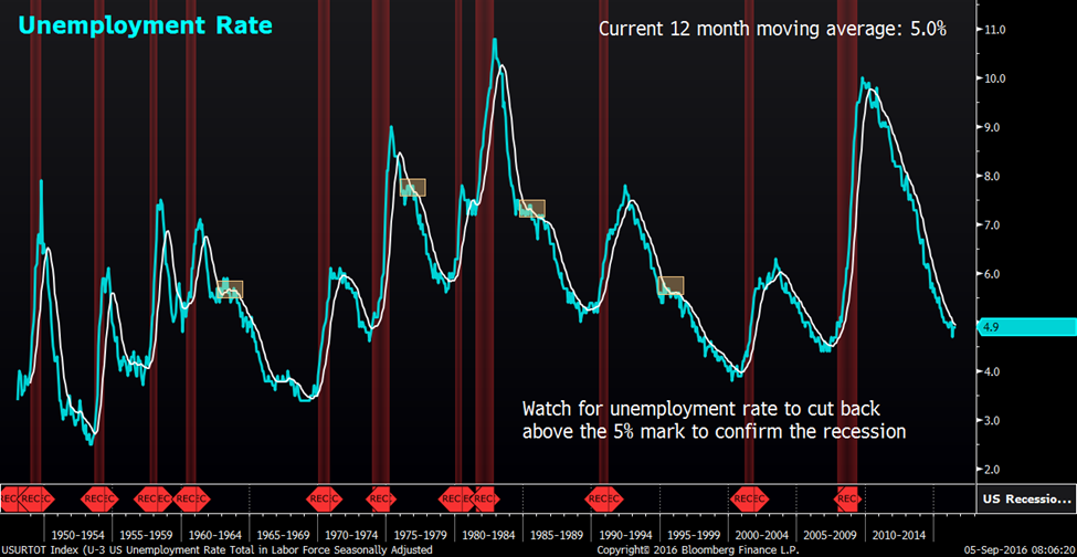
Source: Bloomberg
| This is yet another indicator with high degree of accuracy in terms of forecasting a recession. This study traces as far back as 1948 and we overlay the 12 month moving average onto the US Unemployment rate chart. As the Unemployment Rate ticks up above the 12 month moving average and forms a bottom, the US Economy tends to enter into a period of recession. Since 1948, there were a total of 14 instances where the Unemployment Rate crossed above the 12 month moving average. Out of which, 4 failed (Nov 1962, Nov 1976, June 1985 and April 1995) to call for a recession shown by the highlighted boxes and 10 successfully predicted a looming recession. That implied a 71% accuracy.
We have seen how the Unemployment Rate behaved recently where it bounced off the 4.7% mark for the month of May to 4.9% for the month of August suggesting a change in trend. The important thing to look out for moving forward is for the Unemployment rate to edge up above the 12 month moving average which currently stands at 5%. When that happens, it should provide us with an early warning that the US economy is heading into a recession. |
Chart 10. Philadelphia Federal Reserve Survey Diffusion Index Numbers of Employees
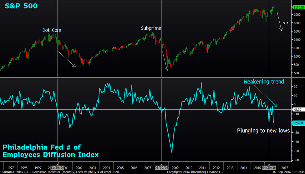
Source: Bloomberg
The Philadelphia Federal Reserve survey diffusion index numbers of employees is part of the monthly survey of manufacturers in the Third Federal Reserve District. The survey’s indicators of employment plunged into new depths for the month of August as it fell 18 points to -20.0 which is the largest negative reading for the year. This shows a huge disparity from the healthy Non-Farm payroll data.
| The past 2 occasions when the Philly Fed employment survey diffusion index fell below -5.10, it was greeted by some serious market correction. It happened during both the Dot-Com and Subprime crisis period. Currently, the index is hovering near the recessionary period lows again at -20.0, warning for some possible market correction.
Chart 11. Labor Market Condition Index (LMCI) |
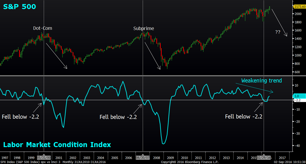
Source: Bloomberg
| The Federal Reserve Labor Market Condition Index is a good representation of the health of the US labor market as it takes into account 19 monthly labor market indicators. The LMCI is showing some weakness as well with the index falling below -2.2 for the month of February.
We have seen how the LMCI actually signaled for massive market corrections when it contracted below -2.2 back in May 2000 and June 2007, well in line with forming the respective market tops. Currently, the LMCI has somewhat recovered marginally as it bounced back above the negative region to 1.0 for the month of July. However, the trend remained weak and the current picture looks eerily similar to the 2000 and 2007 episode. Look out for the turnaround below -2.2 to confirm the weakness in the underlying labor market where some market correction should materialize. In conclusion, we have presented a lists of macro indicators to show the underlying weakness within the US economy and how they have behaved during crisis periods. Some have confirmed the bearish narrative while others are about to confirm. The table below shows the respective figures that we will be closely monitoring moving forward for the different set of macro indicators. |
Macro signals
Once the rest of the indicators especially the GDP YoY and Unemployment Rate indicator confirm the bearish signal, there will be a higher likelihood of a sharp market correction.
|
Important Information
This report is prepared and/or distributed by Phillip Securities Research Pte Ltd ("Phillip Securities Research"), which is a holder of a financial adviser’s licence under the Financial Advisers Act, Chapter 110 in Singapore.
By receiving or reading this report, you agree to be bound by the terms and limitations set out below. Any failure to comply with these terms and limitations may constitute a violation of law. This report has been provided to you for personal use only and shall not be reproduced, distributed or published by you in whole or in part, for any purpose. If you have received this report by mistake, please delete or destroy it, and notify the sender immediately.
The information and any analysis, forecasts, projections, expectations and opinions (collectively, the “Research”) contained in this report has been obtained from public sources which Phillip Securities Research believes to be reliable. However, Phillip Securities Research does not make any representation or warranty, express or implied that such information or Research is accurate, complete or appropriate or should be relied upon as such. Any such information or Research contained in this report is subject to change, and Phillip Securities Research shall not have any responsibility to maintain or update the information or Research made available or to supply any corrections, updates or releases in connection therewith.
Any opinions, forecasts, assumptions, estimates, valuations and prices contained in this report are as of the date indicated and are subject to change at any time without prior notice. Past performance of any product referred to in this report is not indicative of future results.
This report does not constitute, and should not be used as a substitute for, tax, legal or investment advice. This report should not be relied upon exclusively or as authoritative, without further being subject to the recipient’s own independent verification and exercise of judgment. The fact that this report has been made available constitutes neither a recommendation to enter into a particular transaction, nor a representation that any product described in this report is suitable or appropriate for the recipient. Recipients should be aware that many of the products, which may be described in this report involve significant risks and may not be suitable for all investors, and that any decision to enter into transactions involving such products should not be made, unless all such risks are understood and an independent determination has been made that such transactions would be appropriate. Any discussion of the risks contained herein with respect to any product should not be considered to be a disclosure of all risks or a complete discussion of such risks.
Nothing in this report shall be construed to be an offer or solicitation for the purchase or sale of any product. Any decision to purchase any product mentioned in this report should take into account existing public information, including any registered prospectus in respect of such product.
Phillip Securities Research, or persons associated with or connected to Phillip Securities Research, including but not limited to its officers, directors, employees or persons involved in the issuance of this report, may provide an array of financial services to a large number of corporations in Singapore and worldwide, including but not limited to commercial / investment banking activities (including sponsorship, financial advisory or underwriting activities), brokerage or securities trading activities. Phillip Securities Research, or persons associated with or connected to Phillip Securities Research, including but not limited to its officers, directors, employees or persons involved in the issuance of this report, may have participated in or invested in transactions with the issuer(s) of the securities mentioned in this report, and may have performed services for or solicited business from such issuers. Additionally, Phillip Securities Research, or persons associated with or connected to Phillip Securities Research, including but not limited to its officers, directors, employees or persons involved in the issuance of this report, may have provided advice or investment services to such companies and investments or related investments, as may be mentioned in this report.
Phillip Securities Research or persons associated with or connected to Phillip Securities Research, including but not limited to its officers, directors, employees or persons involved in the issuance of this report may, from time to time maintain a long or short position in securities referred to herein, or in related futures or options, purchase or sell, make a market in, or engage in any other transaction involving such securities, and earn brokerage or other compensation in respect of the foregoing. Investments will be denominated in various currencies including US dollars and Euro and thus will be subject to any fluctuation in exchange rates between US dollars and Euro or foreign currencies and the currency of your own jurisdiction. Such fluctuations may have an adverse effect on the value, price or income return of the investment.
To the extent permitted by law, Phillip Securities Research, or persons associated with or connected to Phillip Securities Research, including but not limited to its officers, directors, employees or persons involved in the issuance of this report, may at any time engage in any of the above activities as set out above or otherwise hold an interest, whether material or not, in respect of companies and investments or related investments, which may be mentioned in this report. Accordingly, information may be available to Phillip Securities Research, or persons associated with or connected to Phillip Securities Research, including but not limited to its officers, directors, employees or persons involved in the issuance of this report, which is not reflected in this report, and Phillip Securities Research, or persons associated with or connected to Phillip Securities Research, including but not limited to its officers, directors, employees or persons involved in the issuance of this report, may, to the extent permitted by law, have acted upon or used the information prior to or immediately following its publication. Phillip Securities Research, or persons associated with or connected to Phillip Securities Research, including but not limited its officers, directors, employees or persons involved in the issuance of this report, may have issued other material that is inconsistent with, or reach different conclusions from, the contents of this report.
The information, tools and material presented herein are not directed, intended for distribution to or use by, any person or entity in any jurisdiction or country where such distribution, publication, availability or use would be contrary to the applicable law or regulation or which would subject Phillip Securities Research to any registration or licensing or other requirement, or penalty for contravention of such requirements within such jurisdiction.
This report is intended for general circulation only and does not take into account the specific investment objectives, financial situation or particular needs of any particular person. The products mentioned in this report may not be suitable for all investors and a person receiving or reading this report should seek advice from a professional and financial adviser regarding the legal, business, financial, tax and other aspects including the suitability of such products, taking into account the specific investment objectives, financial situation or particular needs of that person, before making a commitment to invest in any of such products.
This report is not intended for distribution, publication to or use by any person in any jurisdiction outside of Singapore or any other jurisdiction as Phillip Securities Research may determine in its absolute discretion.
IMPORTANT DISCLOSURES FOR INCLUDED RESEARCH ANALYSES OR REPORTS OF FOREIGN RESEARCH HOUSE
Where the report contains research analyses or reports from a foreign research house, please note:

Jeremy specialises in Technical Analysis and has 10 years of experience in studying price action. His areas of expertise include intermarket analysis on the equities, currencies, commodities and bonds market.
He is also a regular columnist on The Business Times - every Monday ChartPoint column.
He graduated with a Bachelor of Science in Banking and Finance from University of London.